


PT
A clínica da Dra. Chiara Ayres, localizada no Rio de Janeiro, é especializada em saúde da mulher. Surgiu a partir da necessidade de trazer um olhar moderno para a saúde feminina, que vai além da atenção básica voltada a reprodução e gestação, passando a enxergar a mulher contemporânea em sua totalidade, com um olhar a partir de aceitação, liberdade e empoderamento.
Durante a etapa de imersão, foi feita uma pesquisa extensa da história e contexto atual da atenção integral à saúde da mulher, os avanços e necessidades atuais do setor, além de um olhar para a construção social e histórica de gênero, e sobre como certas visões antiquadas e preconceitos ainda perduram na sociedade e até na comunicação de médicos.
Startups de femcare e femtech foram referenciais importantes, assim como outras clínicas que trazem um olhar atual para expressão de marca. Quando olhamos para o cenário local, há uma indústria ainda dominada por uma visão restritiva e pouco representativa da saúde da mulher e o que é "ser saudável" – A obsessão com estética, peso, e que reforça modelos de gênero impostos.
EN
The clinic founded by Dr. Chiara Ayres is based in Rio de Janeiro and specializes in female health care. It was started from the need of bringing a modern look to female care in Brazil, one that goes beyond basic reproduction and gestation needs, broadening the attention to one that sees the modern woman as a whole, with a vision that comes from acceptance, freedom and empowerment.
The clinic founded by Dr. Chiara Ayres is based in Rio de Janeiro and specializes in female health care. It was started from the need of bringing a modern look to female care in Brazil, one that goes beyond basic reproduction and gestation needs, broadening the attention to one that sees the modern woman as a whole, with a vision that comes from acceptance, freedom and empowerment.
During the diagnostic phase of branding, extensive research was done on the history and context of integral women's health care in Brazil, it's advancements and current shortcomings. We also looked at the social and historical views of gender roles, which showed how certain antiquated views still have a lasting impact, even in how doctors communicate with women.
Current femcare and femtech startups were also important benchmarks in the process, and so were other modern clinics around the world that are bringing a more up-to-date view to brand expression. But when we looked at the local landscape, there's still an industry dominated by restrictive views and little representation in women's health and what it means to "be healthy" – Obsessions with aesthetics, weight, and reinforcing imposed gender roles.
Current femcare and femtech startups were also important benchmarks in the process, and so were other modern clinics around the world that are bringing a more up-to-date view to brand expression. But when we looked at the local landscape, there's still an industry dominated by restrictive views and little representation in women's health and what it means to "be healthy" – Obsessions with aesthetics, weight, and reinforcing imposed gender roles.

PT
Prestativa, libertadora.
A partir de conversas e workshops foram discutidas definições importantes para a estratégia. Públicos, posicionamento e personalidade à partir de arquétipos, foram organizados e detalhados considerando os valores que a médica já carrega, mas que precisavam ser expressados verbal e visualmente.
A frase de posicionamento que sintetiza a marca é cuidar para transformar. "Cuidar" define o que a médica faz, e parte do arquétipo da Prestativa – altruísta, movida pela compaixão e generosidade. "Transformar" fala da motivação e vem do arquétipo da Libertadora – honesta, franca e corajosa. Seja através de exames ou só uma conversa sobre como foi seu dia, é sobre cuidar delas para que possam transformar suas próprias realidades, e o mundo.
EN
Caregiver, liberator.
Starting from conversations and workshops, important strategic definitions were set. Audiences, positioning and brand personality based on archetypes, were organized and detailed considering values that the doctor already held close, but needed to be better expressed both verbally and visually.
The brand statement that summarizes the brand is Care to transform. "Care" tells us what she does, and comes from the Caregiver archetype – selfless and moved by compassion and generosity. "To transform" speaks of her motivation and comes from the Liberator archetype – honest, outspoken and brave. So be it through an exam or just talking about their day, it's about taking care of women so they can transform their own realities, and then the world.
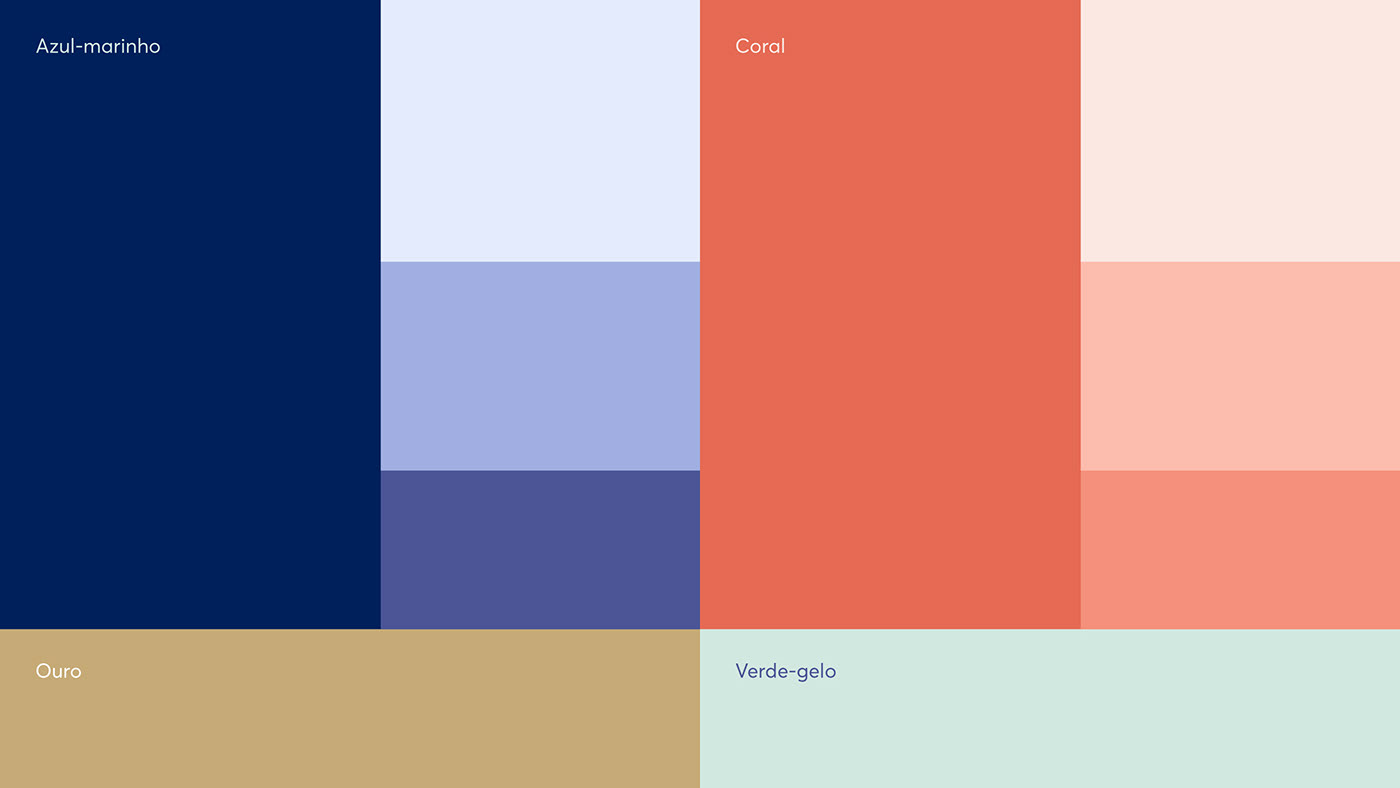

PT
Os elementos visuais não são só uma extensão da personalidade da própria profissional, como também se conectam com o público feminino. O conceito que serviu de base partiu do posicionamento – ideias como carinho e empatia que flui entre duas (ou mais) partes, criando laços de cuidado.
Os elementos visuais não são só uma extensão da personalidade da própria profissional, como também se conectam com o público feminino. O conceito que serviu de base partiu do posicionamento – ideias como carinho e empatia que flui entre duas (ou mais) partes, criando laços de cuidado.
Isso é expressado a partir da conexão entre letras no logotipo, que também possui variações para diferentes necessidades de composição. A identidade é complementada por grafismos minimalistas, quase abstratos, inspirados em formas femininas. Um conjunto de ícones e ilustrações também foram criados para dar mais possibilidades à marca para abordar diversos assuntos, principalmente na comunicação em redes sociais.
EN
The visual elements are not just an expression of the doctor's own personality, they also connect with her audience. The base concept came from the positioning – ideas like care and empathy that flow between two (or more) parts, creating bonds of care.
This is expressed by connecting letter shapes in the logotype, which also has variants for different layouts. The identity is complemented by minimal graphic elements, which are almost abstract, but are in fact inspired by female forms. A set of icons and illustrations were also created to give the brand more flexibility when approaching various topics, specially in social media communication.


ROLES: Brand Strategy, Verbal Identity, Visual Identity, Illustrations


